BiziTopics
Beautiful Emails Don’t Always Win. Smart Ones Do
BiziBusiness
Aug 12, 2025
14 min read
Email marketing delivers the highest ROI of any digital channel, but too many brands still chase aesthetic perfection over strategic impact. While a beautifully designed email might turn heads, it won’t necessarily drive conversions, especially if it distracts from the message, triggers spam filters, or loads poorly on mobile.
Segmentation is the foundation of every winning email campaigns. The truth is, smart emails succeed because they are built with a clear purpose: they use persuasive copy and are designed with mobile users in mind, ensuring every message is perfectly tailored for the right audience.
The Real Goals Of Email Design
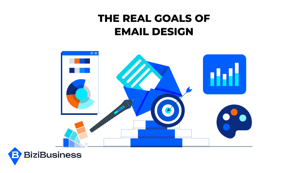
Email design is far more than a matter of aesthetics—it’s about crafting a strategic experience that aligns with deeper business objectives. At its core, email design must be intentional, goal-oriented, and optimized for user engagement. Let’s break down the real goals that drive high-performing email design.
Conversions, Engagement, Brand Trust, and Deliverability
The ultimate aim of email design is to influence action. Whether it’s encouraging a purchase, generating a reply, or driving a click-through to a landing page, conversion is the holy grail. But conversions don’t happen in a vacuum—they stem from an engaged, trusting audience who consistently receives and opens your emails.
- Engagement starts with visual appeal and clarity—emails must be easy to read, skim, and interact with across devices.
- Brand trust builds through consistent design elements (like fonts, colors, and tone) that echo your website and overall identity, helping subscribers feel familiar and secure.
- Deliverability is often overlooked but critical. Poorly designed emails (e.g., image-heavy, slow-loading, or misformatted on mobile) can trigger spam filters or reduce sender reputation, undermining the entire strategy.
A well-designed email creates a seamless, branded, and trustworthy experience that guides the reader naturally toward action.
Metrics That Matter: CTR, Open Rates, Reply Rates, Revenue Per Email
To evaluate success, email marketers must focus on a few key performance indicators (KPIs):
- Open rates signal subject line performance and initial interest.
- Click-through rates (CTR) reflect how well the content and design motivate users to act.
- Reply rates indicate how compelling or conversation-worthy the content is—especially important in relationship-driven campaigns.
- Revenue per email ties it all back to business impact, showing ROI for every campaign.
These analytics and metrics aren’t just numbers—they are insights that should shape future design and content choices. By A/B testing and optimization, CTA styles, and formats, marketers can continually improve performance and better understand their audience’s preferences.
Reader-First vs. Brand-First Design
One of the biggest tensions in email design lies between reader-first and brand-first approaches.
- Reader-first design focuses on utility and clarity. It prioritizes readability, accessibility, and what the subscriber wants to see—clear value, fast load time, easy navigation.
- Brand-first design, on the other hand, emphasizes aesthetic cohesion and brand integrity, sometimes at the expense of usability.
The sweet spot is a balance—emails should reflect your brand without compromising user experience. If a beautifully branded email fails to engage or is too cluttered to navigate, the design has failed. Conversely, a plain-text email that feels personal and performs well might be more effective for certain audiences or goals.
Ultimately, winning email design puts the reader first while reinforcing the brand, ensuring that every visual and textual element nudges the subscriber closer to action.
Common Design Pitfalls (That Look Good But Don’t Work)

When it comes to email marketing, beautiful design can be deceptive. Many emails that look polished and professional actually underperform because they neglect functionality, accessibility, or user experience. Here are the most common pitfalls to watch out for:
Over-Designed Headers and Image-Only Emails
Large, complex headers might look impressive—but they often delay load time, push critical content below the fold, and reduce mobile usability. Image-only emails are even worse. While they might align perfectly with brand visuals, they can:
- Trigger spam filters
- Fail to load correctly on slow connections
- Be invisible to screen readers
- Make CTAs harder to locate or interact with
The result? A visually “nice” email campaigns that frustrates your audience and fails to convert.
“Too Much Branding” vs. Reader-Centric Flow
Heavy branding—such as oversized logos, color-saturated sections, or dense product showcases—can overwhelm the reader. When every part of the email screams look at me, the actual message can get lost. Overbranding prioritizes the sender’s ego over the reader’s experience.
A reader-centric flow, on the other hand, gently guides the recipient through a narrative. It uses whitespace, concise copy, and scannable structure to let the reader quickly find what they care about—and take action.
Mobile-Unfriendly Layouts
With more than half of all emails being opened on mobile devices, ignoring mobile optimization is a critical error. Common issues include:
- Multi-column designs that don’t collapse properly
- Tiny tap targets (e.g., buttons or links)
- Font sizes that require zooming
- Slow-loading graphics or background images
A mobile-first mindset ensures your emails function smoothly no matter where they’re viewed. Prioritize a single-column layout, responsive typography, and clear calls to action that are easy to tap.
Accessibility Issues: Fonts, Contrast, Structure
Your email design needs to work for everyone, including people with visual or cognitive impairments. Common accessibility problems include:
- Low contrast between text and background
- Fonts that are too decorative or too small
- Poorly structured HTML that confuses screen readers
- Missing alt text for images
Inclusive design isn’t just about compliance—it expands your reach and reflects well on your brand. The best designs are both beautiful and functional, serving every reader with clarity and ease.
Smart Design Starts With Strategy

Behind every high-performing email lies a clear, intentional strategy. Beautiful design means nothing without purpose—and in email marketing, that purpose must be aligned with business objectives. Smart design doesn’t begin in Photoshop or Figma; it starts with a strategic foundation.
Email Objective First: Sell, Nurture, Announce?
Before touching layout or visuals, ask: What’s the goal of this email?
- Selling? The design should build urgency, highlight product benefits, and drive clicks to a purchase page.
- Nurturing? The tone should be softer, the layout more educational, with clear value-building elements.
- Announcing? The message should be front-loaded, bold, and easy to digest in seconds.
The objective determines everything from copy length and tone to CTA prominence and visual weight. If you start with design before defining the goal, you risk sending a gorgeous email that doesn’t convert.
Visual Hierarchy That Guides Attention
Smart design directs the eye. Visual hierarchy uses contrast, size, color, and spacing to lead readers through content intuitively.
A strong hierarchy ensures:
- Headlines pop and pull people in
- Key benefits and offers are quickly scannable
- Secondary details don’t distract from the CTA
Use this hierarchy to structure your content like a story—starting with a hook, leading through interest, and finishing with a clear ask.
CTA Placement and Repetition
Your call to action (CTA) is the linchpin of conversion. Yet many emails bury it, use weak language, or only mention it once.
Best practices include:
- Placing your first CTA early, ideally above the fold
- Repeating it later for readers who scroll
- Making CTAs bold, button-based, and easy to tap on mobile
If your CTA is hard to find or too subtle, your audience won’t act—no matter how well the rest of the email performs.
Using Whitespace With Purpose
Whitespace is not wasted space—it’s a design tool. It gives your content breathing room, improves readability, and makes CTAs pop.
Effective use of whitespace:
- Separates key sections for better flow
- Prevents visual overwhelm
- Focuses attention where it matters most
Don’t cram your emails full of content. Instead, design with restraint. Strategic whitespace leads to a cleaner, more calming reading experience—making your message more effective.
The Psychology Behind High-Converting Emails
The best email designs don’t just look good—they feel right to the reader. They tap into subconscious behavior, attention patterns, and emotional triggers to guide action. If you want higher conversions, you must design with psychology in mind.
How People Scan: F-Pattern and Mobile Thumb Zones
Readers don’t read emails—they scan them.
- On desktop, studies show we scan in an F-pattern: top-left to right, then down the left edge with occasional horizontal sweeps. This means the most valuable content and CTAs should be aligned to the left and placed early.
- On mobile, thumb zones dictate usability. Users naturally interact with the middle and bottom-right area of the screen. CTAs placed here are more likely to be tapped, especially if they’re thumb-sized and spaced well.
Knowing these patterns allows you to design layouts that automation & workflows with your reader’s instincts, not against them.
Using Behavioral Design (e.g. Scarcity, Social Proof)
Human behavior is predictable—and design can leverage it. Some high-impact psychological triggers include:
- Scarcity: “Only 5 left” or “Offer expires tonight” adds urgency and compels immediate action.
- Social proof: Testimonials, user stats, and customer logos show that others trust you, reducing perceived risk.
- Contrast bias: Highlighting the best option next to less attractive ones helps drive the choice you want.
- Commitment consistency: Small asks (like reading a tip or clicking a button) build momentum toward bigger actions later.
Design supports these tactics by making them visually prominent, emotionally resonant, and easy to act on.
Aligning Tone and Design With Intent
Effective list building is about more than just collecting emails; it’s about knowing your audience. If you’re promoting a flash sale, a minimalist layout won’t work. Likewise, using aggressive language to nurture a cold lead can backfire.
Effective design matches the psychological state of the reader:
- Use bold visuals and energetic copy for promotions.
- Use soft tones, clean layouts, and plenty of white space for education or onboarding.
- Use interactive elements or micro-conversions (like polls or clickable modules) to boost engagement in re-engagement flows.
Design isn’t neutral—it communicates mood, urgency, and trust. Make sure your tone, layout, and color palette support your objective and speak to your audience’s state of mind.
Design Elements That Move The Needle

High-performing emails aren’t just well-written—they’re strategically built. Specific design elements can dramatically enhance clarity, engagement, and conversions. Here’s what truly makes a difference:
Modular Layouts for Clarity and Flexibility
Modular design breaks content into distinct, stackable blocks—each with its own purpose and flow. This layout:
- Improves scanability by letting readers absorb info in chunks
- Allows easier A/B testing of individual modules
- Offers flexibility to repurpose components across campaigns
From a welcome series to product launches, modular layouts support rapid production without sacrificing consistency or user experience.
Real Copy Hierarchy (Not Just H1 > H2)
True hierarchy isn’t about font size alone—it’s about meaningful visual prioritization.
- Use contrast, font weight, and color to make the most important messages pop
- Limit yourself to 1–2 main headlines and 1 CTA per module to reduce decision fatigue
- Support scannability with subheaders, bullets, and short paragraphs
When readers can immediately understand what matters and why, they’re far more likely to act.
Interactive Elements (Carousels, Buttons, Collapsible Sections)
Interactive design isn’t just eye candy—it increases engagement, especially on mobile. Consider:
- Carousels: Great for showcasing multiple products or testimonials without overwhelming the layout
- Collapsible sections: Let readers self-navigate deeper content like FAQs or how-tos
- Buttons: Should be large enough to tap easily, use action-first language, and provide feedback (like hover or click states)
Even lightweight interactivity can boost click-through rates and reduce bounce, just be sure it’s compatible with your email platform and tested cross-channel integration.
Visual Cues: Arrows, Progress Bars, Countdown Timers
People respond to directional cues, especially when they subtly encourage action or build urgency.
- Arrows guide the eye toward CTAs or key messages
- Progress bars increase completion rates in multi-step funnels or onboarding sequences
- Countdown timers create urgency for limited-time offers or cart expirations
These aren’t gimmicks. They’re behavioral nudges designed to keep your readers engaged and moving forward.
Smart Tools And Templates For Better Design

Modern email design doesn’t have to be time-consuming or complex. With the right tools and platforms, you can create high-converting campaigns faster and more efficiently. Here’s how to build smarter, not harder.
Top Tools for Building Smart Emails (e.g. Stripo, BeeFree, Litmus)
Design platforms have come a long way. These tools simplify the process and help ensure your emails look great across devices:
- Stripo: A drag-and-drop email builder with modular design blocks, AMP support, and platform integrations.
- BeeFree: Offers a fast, intuitive editor and tons of ready-to-use templates ideal for marketers and agencies alike.
- Litmus: Not just a builder, but a testing powerhouse. It previews your emails across dozens of clients and devices to catch layout or rendering issues before you hit send.
Using professional tools means fewer design headaches and better results.
Pre-Tested Templates for Performance
Instead of starting from scratch, use templates designed around performance best practices. These templates already account for:
- Mobile responsiveness
- Visual hierarchy
- Strategic CTA placement
- Readability and accessibility
Look for templates that align with your email goals, whether it’s lead nurturing, product promotion, or onboarding. Customize colors and branding without sacrificing what makes the layout effective.
A/B Testing: Layout, CTA, Visual Emphasis
Even great design benefits from optimization. A/B testing helps you pinpoint what works best for your audience. Key elements to test include:
- Layout: Single-column vs multi-block, short vs long format
- CTA: Button text, color, size, and placement
- Visual emphasis: Image vs text balance, headline prominence, spacing
Test one element at a time for accurate results, and use the data to refine future designs. Over time, this leads to smarter decisions and consistently better performance.
How BiziBusiness Applies Smart Design
At BiziBusiness, we don’t just teach smart email design—we live it in every campaign we run. Our team applies a strategy-first mindset that ensures every design decision aligns with business outcomes. Here’s how we put our principles into practice.
Key Principles We Use in Our Own Campaigns
Every email we send starts with a clear objective. Whether we aim to educate, promote, or engage, our design choices support that goal from the first line to the final CTA. We rely on:
- Modular layouts that allow agility and testability
- Strategic whitespace that guides the reader’s focus
- Intent-driven content structures that prioritize clarity
- Consistent branding that never overshadows usability
We blend proven user behavior insights with a sharp editorial eye to ensure our emails are effective, not just pretty.
Performance Metrics We Prioritize
Our design reviews don’t end at aesthetics. They begin and end with data. The metrics we pay closest attention to include:
- Click-through rate: Are readers acting on our offers?
- Scroll depth: Are people engaging with the full message?
- Revenue per campaign: Is design directly contributing to conversions?
- Engagement by device: Are our layouts performing well across desktop and mobile?
These numbers guide our iterations and help us refine what truly works.
Design Reviews: Strategy-Led vs. Visual Polish
We don’t get caught up in subjective opinions or shiny distractions. Instead, our design critiques focus on one question: Does this layout move the user toward the goal?
- A CTA that blends into the background fails, no matter how sleek it looks
- A headline that doesn’t align with user intent gets reworked
- Designs are tested for usability and accessibility before visual perfection
Smart design is functional first and polished second. By keeping our reviews strategy-led, we ensure our creative output consistently drives real results.
Final Thoughts: Function Beats Flash
Design that looks good is nice. Design that performs is better. In email marketing, flashy layouts and animations may catch the eye, but relevance, clarity, and usability drive results. The best emails don’t try to impress—they focus on guiding the reader toward a clear action.
Before your next send, take a quick audit. Is the message clear within seconds? Are the CTAs easy to find and tap on mobile? Does the design support your goal or distract from it? These small tweaks can lead to big wins.
Want help? Book a free strategy and planning call to review your latest campaign, or grab our Smart Email Design Checklist and see what you might be missing.
Subscribe to Newsletter
Unlock your creativity and stay up to date on marketing tips
