BiziTopics
Your Store Isn’t Broken—Your CRO Strategy Is
BiziBusiness
Jul 8, 2025
22 min read
Your ads are running. Your traffic is growing.
People are visiting your store…
But your sales? Still underwhelming.
Sound familiar?
You’ve got the products. You’ve built the store. Maybe you’ve even hired a designer or upgraded your tech stack.
And yet—your conversion rate is flat.
Let’s set the record straight:
Your store isn’t broken. Your CRO strategy is.
Because here’s the truth no one tells you when you’re scaling an eCommerce brand:
More traffic doesn’t fix a leaky funnel. Better conversion does.
That’s where CRO—Conversion Rate Optimization—comes in.
But not the kind of CRO that lives in random “split test your CTA color” blog posts.
We’re talking real, strategy-backed, data-driven optimization that turns browsers into buyers, and buyers into loyal customers.
In this guide, you’ll learn:
- Why most stores bleed sales (and don’t even know it)
- What CRO really looks like in 2025 (hint: it’s not just A/B testing)
- The pages, elements, and experiences that move the needle
- How top-performing brands treat CRO as a growth engine, not a side project
Ready to stop guessing and start converting?
Let’s dig in.
Why Most eCommerce Stores Bleed Conversions
It’s not your ads. It’s what happens after the click.
You’re driving traffic. You’ve got a great product.
But sales? Still not where they should be.
It’s frustrating. And more often than not, brands blame the wrong thing—the store.
Here’s the truth:
Most stores don’t need a full redesign. They need a conversion strategy.
If you’re struggling to grow, it’s not because your products are bad or your website is “ugly.” It’s because of the hidden friction in your funnel that silently kills conversions—and scales losses with every new visitor.
Let’s break down the assumptions that cost brands the most money:
❌ Assumption #1: “More Traffic Will Solve It”
You don’t have a traffic problem. You have a leverage problem.
If 1 out of 100 visitors is buying, scaling traffic just multiplies waste.
More ad spend ≠ more sales—if your funnel isn’t built to convert.
❌ Assumption #2: “Our Design Looks Great, So We’re Fine”
Great design isn’t the same as great conversion.
Award-winning visuals mean nothing if they don’t drive action.
You need more than pretty fonts and lifestyle photos—you need messaging clarity, trust signals, and action-oriented layouts.
Conversion-first doesn’t mean ugly. But beautiful without purpose is useless.
❌ Assumption #3: “It’s Just a Seasonal Slump”
When sales dip, it’s easy to blame timing. “It’s Q1.” “It’s summer.” “Everyone’s broke.”
But top-performing brands see steady growth year-round—because their funnel is optimized to convert regardless of season.
If your revenue always needs a holiday or flash sale to spike, that’s not a calendar problem. It’s a conversion leak problem.
The Silent Conversion Killers You Don’t See (But Customers Feel)
Here’s the kicker: customers won’t leave feedback about what confused them.
They won’t DM you and say, “Hey, your cart page felt a little sketchy.”
They’ll just leave.
Conversions aren’t just lost on product pages or at checkout. They’re lost in micro-moments—those tiny, often-overlooked interactions that create friction.
Here’s where most eComm stores are silently bleeding sales:
- Slow load times that trigger early exits
- Confusing product page layouts
- Weak or unclear CTAs
- Overwhelming navigation or filter systems
- Pop-ups that interrupt vs. add value
- Lack of urgency or perceived value
- A cart experience that feels clunky or untrustworthy
It’s not one big thing—it’s lots of small things adding up to one big bounce.
That’s why CRO isn’t just “nice to have.” It’s critical to survival in a world of rising ad costs and endless competition.
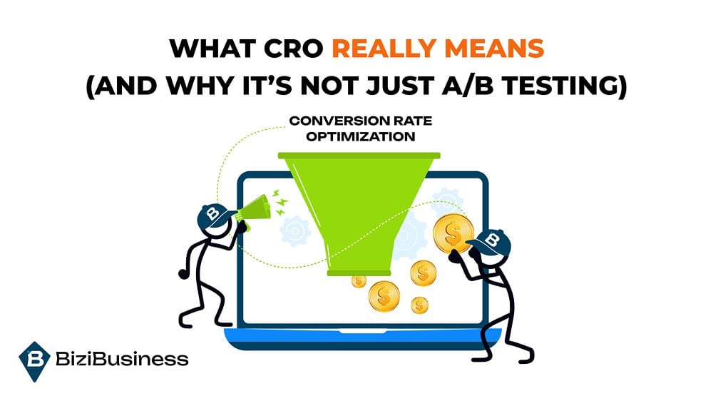
What CRO Really Means (and Why It’s Not Just A/B Testing)
It’s not about gimmicks. It’s about giving people a reason to act.
You’ve probably heard it before:
“You just need to run some A/B tests.”
“Try a red button instead of green.”
“Change your headline. That’ll fix conversions.”
Sounds tactical. Feels proactive.
But in reality?
That’s surface-level CRO.
And if your entire strategy is based on color testing and headline swaps, you’re optimizing noise—not impact.
Let’s reset the definition.
CRO Is the Art and Science of Selling Without Saying a Word
At its core, Conversion Rate Optimization is about creating an environment where buying feels easy, obvious, and safe.
Not pushy. Not hyped. Just… frictionless.
Because most people want to buy.
They just need you to remove the resistance:
- The hesitation.
- The doubt.
- The “eh, I’ll come back later” that turns into never.
CRO is the system that removes everything standing between your customer and your “Buy Now” button.
It’s More Than Just the Product Page
CRO doesn’t live in isolation. It’s not a button tweak on your PDP or a new testimonial on your cart page.
True CRO lives in the entire journey—from the moment someone lands on your site to the moment they see “Order Confirmed.”
It asks:
- What’s confusing about this experience?
- What’s missing from this message?
- Where do people hesitate, and why?
- How can we say more by doing less?
Every page. Every step. Every second.
CRO is the process of optimizing all of it.
It’s Not Guesswork. It’s a Data-Driven Feedback Loop
Here’s where most brands go wrong: they redesign blindly.
New layout, new fonts, new everything—because “it felt stale.”
But high-growth brands don’t guess. They test.
CRO is a scientific method applied to digital behavior:
- Identify the friction
- Hypothesize what’s causing it
- Build a focused experiment
- Measure the impact
- Scale what works
And then? Start again.
Because CRO isn’t one-and-done. It’s a forever lever—something you’re always tuning, always improving.
It’s Not About Conversion Rate. It’s About Profit
Let’s bust one last myth: higher conversion rate ≠ business growth.
If you double your conversion rate by offering 50% off everything?
Congrats—you made less money with more effort.
Real CRO looks at:
- Conversion Rate
- Average Order Value (AOV)
- Revenue Per Visitor (RPV)
- Customer Lifetime Value (LTV)
Because the goal isn’t more orders—it’s more margin, more retention, and more profit per click.
Now let’s get into the must-have fundamentals that every high-converting eCommerce store is built on.
Foundational CRO: The Non-Negotiables
Before you test anything, fix the basics.
Before you run an A/B test.
Before you create a fancy offer stack.
Before you even think about personalization, dynamic content, or interactive quizzes…
You need to nail the foundation.
Because here’s the truth:
No amount of CRO “tactics” will save a store that frustrates people at the most basic level.
If your site loads slow, looks sketchy, or makes buying feel complicated—you’ve already lost the sale.
Let’s talk about the non-negotiables. These are the bare minimums every eCommerce brand needs in place before optimizing for growth.
1. Speed Kills (or Converts)
Your site doesn’t get 10 seconds to impress. It gets about 3.
If your homepage, product pages, or checkout flow load slowly, your bounce rate will spike—and your conversion rate will tank.
You need:
- Sub-3 second page load times
- Compressed images (especially lifestyle and UGC)
- Lazy loading for media-heavy pages
- Mobile-first caching and optimization
2. Mobile UX Is Not a Shrunk-Down Desktop Experience
Mobile traffic dominates most eCommerce stores—and mobile conversion is often your biggest blind spot.
Why? Because most brands build for desktop first, then cram it onto a phone screen later.
You need:
- Large, tappable CTAs
- Sticky add-to-cart bars
- Easy thumb-zone navigation
- Minimalist menus and collapsible filters
- Tap-to-expand images and reviews
3. Product Page Essentials
Your product page is the moment of truth. This is where buyers go to make a decision—and where most stores fall short.
You need:
- High-quality images from multiple angles
- Video or UGC showcasing real use
- Concise, benefit-driven copy (not just specs)
- Clear pricing, variants, and availability
- Trust elements: reviews, guarantees, security badges
- FAQ sections to address objections
4. Cart and Checkout That Don’t Sabotage Sales
Cart abandonment isn’t just about indecision—it’s often about friction.
You need:
- Persistent cart icons with visual feedback
- One-page or multi-step checkout that feels fast
- Multiple payment options (Shop Pay, PayPal, GPay, Apple Pay)
- Auto-fill support for shipping and billing
- Visible return policies and delivery times
- No surprises (hidden fees, required logins, forced upsells)
5. Instant Trust Builders
People buy when they feel confident. They bounce when they feel unsure—even for a second.
You need:
- Visible review counts (with filters for transparency)
- Clear return and refund policy (bonus: satisfaction guarantees)
- Trust badges (secure checkout, SSL, verified reviews)
- Social proof from real people—not just stock testimonials
Trust is built through repetition. Sprinkle it throughout the experience—not just in one section.
When your speed, UX, product pages, trust signals, and checkout flow are dialed in, then—and only then—do CRO tactics actually work.
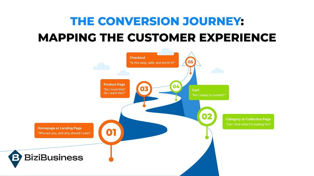
The Conversion Journey: Mapping the Customer Experience
It’s not one page. It’s the whole flow.
Let’s step back for a second.
Imagine walking into a brick-and-mortar store.
You step through the front doors—no signage.
You start browsing—nothing’s organized.
You find a product—no price tag.
You go to check out—it takes forever.
Nobody greets you. Nobody helps.
Do you buy?
Probably not.
Now imagine that store is your website.
Because that’s what most eCommerce experiences feel like to first-time visitors.
The layout is unclear.
The product path is clunky.
The checkout feels sketchy.
And somewhere between “Add to Cart” and “Place Order,” you lose them.
That’s why CRO isn’t just about improving a product page or tweaking button copy.
It’s about mapping—and optimizing—the entire conversion journey.
Let’s walk it step by step.
The Real Journey of a Buyer (Whether You Realize It or Not)
- Homepage or Landing Page
➡️ “Who are you, and why should I care?” - Category or Collection Page
➡️ “Can I find what I’m looking for?” - Product Page
➡️ “Do I trust this? Do I want this?” - Cart
➡️ “Am I ready to commit?” - Checkout
➡️ “Is this easy, safe, and worth it?”
That’s it.
Five steps.
And at each one, there’s a chance to build momentum—or lose it.
Where Brands Lose Customers (And Don’t Even Know It)
Most drop-offs don’t happen because people change their mind.
They happen because the site didn’t give them a reason to keep going.
Let’s break it down:
1. Homepage or Landing Page
If your homepage looks nice but says nothing? You’re invisible.
First-time visitors need clarity, not creativity.
They should land and instantly understand:
- Who you are
- What you sell
- Why it matters
- What to do next
No more sliders, vague taglines, or 12 CTAs. One bold value prop. One goal. Clear path forward.
2. Collection Pages
This is the digital version of the product aisle. But if it’s cluttered or overwhelming, users back out fast.
People don’t scroll endlessly—they scan for signals.
If everything looks the same, nothing stands out.
Use badges like “Best Seller,” “New,” or “Editor’s Pick.” Show star ratings. Add quick views. Guide the eye to high-performing products.
3. Product Pages
This is the moment of truth. Either they believe, or they bounce.
It’s not just about what you sell. It’s about how clearly you communicate why it matters.
If your copy reads like a tech spec sheet… you’re doing it wrong.
Use real customer language. Focus on benefits, not features. Embed UGC. Answer objections. And always—always—make the CTA impossible to miss.
4. Cart Page
This is where friction often blindsides people.
Surprise fees. Confusing totals. “What happens next?” syndrome.
If anything in the cart feels off, people hesitate—and hesitation kills conversions.
Be transparent. Simplify. Offer upsells, but don’t overwhelm. And show them they’re almost done.
5. Checkout
Checkout is not the time to get cute. It’s the time to be clean, fast, and reassuring.
No one wants to fight with a form when they’re ready to give you money.
Offer guest checkout. Let autofill do its job. Show payment icons, shipping estimates, and security badges. Get out of the way and let them buy.
You Don’t Need to Guess Where People Drop Off—Your Tools Will Tell You
Every eCommerce team should have a customer behavior dashboard.
You should be looking at:
- Funnel drop-off rates (GA4)
- Scroll and click maps (Hotjar, Clarity)
- Session replays to see real customer journeys
These tools show you what users are doing, where they’re stopping, and what needs fixing first.
Don’t wait until revenue dips to look under the hood. CRO is proactive, not reactive.
Let’s unlock the actual CRO tactics top brands are using to convert like crazy.
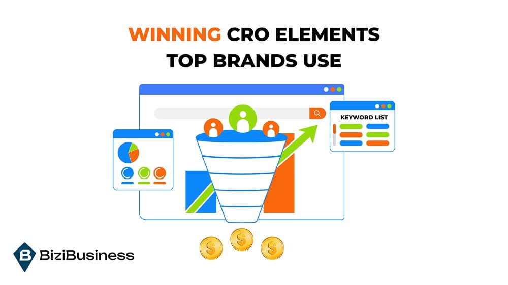
Winning CRO Elements Top Brands Use
If you want higher conversions, stop guessing—and start modeling what works.
Here’s the thing: high-performing eCommerce brands aren’t lucky.
They’re not just “good at design.”
They’ve built systems that turn intent into action, using proven conversion elements that guide users to the buy button with clarity, confidence, and urgency.
Let’s break down the real-world CRO elements that work in 2025—because button color isn’t one of them.
1. Headlines That Sell, Not Just Sound Good
Your headline is the first thing they see. And no, “Welcome to Our Store” isn’t helping you.
Top brands write benefit-driven headlines that:
- Answer the question: “Why should I care?”
- Highlight transformation, not features
- Hook the reader emotionally, then deliver logically
2. Offer Stacks That Drive Action
A 10% discount isn’t enough anymore. You need to stack your offer to create perceived value and remove hesitation.
What top brands do:
- Combine discount + free shipping
- Add a bonus or free gift
- Use tiered incentives (Spend $75, get X)
- Emphasize limited availability or expiring offers
It’s not about being pushy—it’s about giving people a reason to act now, not “later.”
3. Smart, Contextual CTAs
Not all CTAs should say “Add to Cart.”
That works when intent is high. But elsewhere in the funnel, you need CTAs that meet users where they are.
Winning CTA variations:
- “Find Your Fit” → Quiz
- “See It In Action” → Video
- “Compare Options” → Comparison landing page
- “Get 15% Off First Order” → Lead capture
- “Try It Risk-Free” → Trust-driven CTA
The more aligned your CTA is with user intent, the more likely they’ll click.
4. Visuals That Build Confidence, Not Just Aesthetics
Design isn’t just about looking pretty.
It’s about removing doubt and accelerating trust.
Top brands use:
- Real UGC instead of just polished studio shots
- Lifestyle images that show the product in context
- Explainer videos or loops for high-AOV items
- Side-by-side visuals that compare SKUs
Show the product solving the problem—not just existing on a white background.
5. Objection-Killing Copy and Content
Customers won’t always ask questions out loud—but you better answer them anyway.
Top-converting sites proactively address:
- “What if it doesn’t work for me?” → Guarantees & testimonials
- “Is it worth the price?” → Value stacking & outcome framing
- “What do others think?” → Review snippets & star ratings
- “How long will it take to get here?” → Shipping timelines
Every answered objection is one less reason to bounce.
6. Personalized, Guided Experiences
If your store feels like a maze, users will leave. Top brands simplify the journey with guided shopping tools that personalize the path.
Examples:
- “Find your perfect bundle” quiz
- Size or product selectors
- Dynamic recommendations based on cart behavior
- Smart upsells (“Pairs well with…” or “Others also bought”)
The goal is to reduce decision fatigue and make every next step feel obvious.
7. Urgency and Scarcity—Done Right
Urgency doesn’t mean fake countdown timers anymore. That’s outdated and kills trust.
Instead, smart CRO uses authentic urgency:
- “Only 14 left in stock”
- “Shipping cutoff for holiday delivery: 2 days”
- “This item sells out weekly—don’t wait”
Urgency works when it’s real—and when it respects the user’s intelligence.
The best CRO elements don’t feel like “tactics.” They feel like clarity.
They remove confusion.
They build trust.
They guide people to say yes—faster, more confidently, and with less friction.
And they work because they’re rooted in what real customers need to take action.
Next—let’s dive into one of the most overlooked (but mission-critical) parts of eCommerce CRO:
CRO for Mobile: Why Mobile UX Isn’t Just Shrinking Desktop
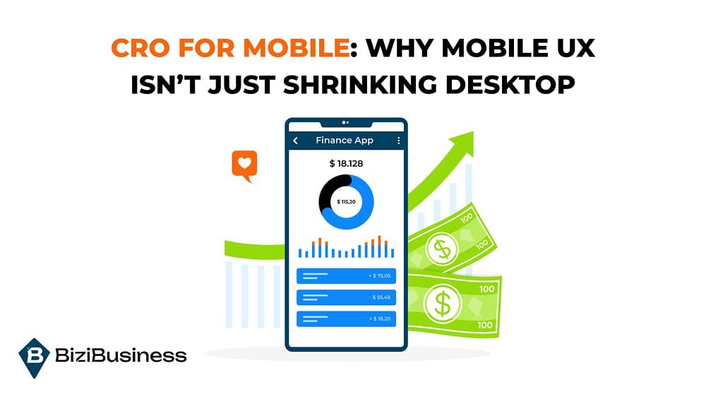
If you’re still designing for desktop first, you’re building for yesterday’s customer.
Let’s paint the picture.
A customer sees your ad.
They tap.
They land on your product page—on their phone, one thumb scrolling while the other holds a coffee.
They’re curious… but distracted. Scrolling fast. Maybe riding in an Uber. Maybe standing in line.
What happens next?
That moment—on a 6-inch screen—can make or break your sale.
Mobile CRO isn’t about making things smaller. It’s about making the experience smoother.
Here’s how conversion-focused brands are designing mobile-first journeys that make it easy to say yes.
1. Navigation That Doesn’t Make You Think
Mobile users aren’t exploring. They’re hunting.
They want clarity, not cleverness.
Menus should be minimal, accessible, and instantly useful.
✔️ Focus on:
- Tap-friendly nav bars (no tiny targets)
- Simplified menu categories
- Clear access to search and cart
- Filters that collapse, not overwhelm
If it takes more than 3 taps to find a product, you’re losing people.
2. Checkout That Moves at Tap-Speed
Mobile checkout needs to feel effortless.
People are ready to buy—until your site slows them down with login walls, endless fields, or confusing flows.
✔️ Optimize for:
- Guest checkout (no forced account creation)
- Express pay options (Shop Pay, Apple Pay, Google Pay)
- Auto-fill support
- Progress indicators so users know what’s next
A fast checkout = less time to rethink the purchase.
3. Visuals That Load Fast & Make the Sale
Mobile shoppers are visual-first.
But huge, uncompressed images = slow load time = bounces.
✔️ Your visuals should:
- Be mobile-optimized and compressed
- Load top-down (prioritize product imagery first)
- Include swipeable carousels, tap-to-zoom, and lifestyle context
- Never block the CTA
Visuals don’t just show the product—they help users imagine owning it.
4. CTAs That Are Bold, Clear, and Always Visible
Mobile users scroll fast—and if your CTA blends in, it’s gone.
✔️ CRO-smart CTAs:
- Use clear contrast (no ghost buttons)
- Stay visible (think sticky footers or floating buttons)
- Use actionable copy: “Buy Now,” “Try Risk-Free,” “Get 15% Off”
- Are placed early—don’t make users hunt for the next step
Your CTA should be the loudest voice in the room—without shouting.
5. Design for Mobile Behavior (Not Desktop Logic)
Mobile shoppers don’t follow clean funnels.
They browse, pause, compare, leave, come back later.
It’s messy—and your site needs to support that loop.
✔️ Your CRO strategy should:
- Make it easy to resume a session
- Auto-save carts (even when not logged in)
- Send helpful reminders or exit popups if the user bails
- Let them pick up where they left off, cross-device
The goal isn’t to close the sale in one session. It’s to guide momentum across many.
6. Test Like a Mobile User, Not a Desktop Marketer
If you’re only checking your site on a laptop, you’re missing the real story.
✔️ Use tools to:
- Track tap patterns, scroll maps, and rage clicks
- Replay mobile sessions and spot friction points
- A/B test mobile-specific layouts and copy
Desktop testing won’t fix mobile problems. Go where your users are.
If your site doesn’t sell beautifully on mobile, it doesn’t scale. Period.
Today’s buyer is busy, distracted, and always scrolling.
If your store isn’t built for that—you’re not just missing conversions. You’re training people to bounce.
Testing That Actually Moves the Needle
Because if you’re not testing, you’re just assuming.
The goal of testing isn’t change—it’s clarity. It tells you what actually works—not what you think works.
Here’s how to build a testing process that actually drives revenue.
1. Start With a Hypothesis—Not a Hunch
Great tests don’t come from random ideas.
They start with a real friction point + a theory on how to fix it.
Use data to identify:
- Pages with high traffic but low conversion
- Where users are bouncing, hesitating, or stalling
- Where your funnel feels “stuck”
Then ask: What might reduce that friction?
That’s your test.
2. Focus on High-Impact Variables
Not everything is worth testing.
You want leverage, not busywork.
Prioritize testing:
- Headlines (value-focused vs benefit-driven)
- Product copy (features vs transformation)
- CTA placement, size, and wording
- Image order or inclusion of video/UGC
- Offer messaging (free shipping vs % discount)
Start where user behavior shows hesitation—not where the design team is bored.
3. Micro vs. Macro Conversions: Know What You’re Optimizing For
A sale isn’t the only thing that matters.
Test for:
- Micro conversions: Add to cart, email sign-up, quiz starts, scroll depth
- Macro conversions: Completed purchases, AOV, LTV
Sometimes improving a micro metric boosts your funnel without increasing your conversion rate—but increases your revenue per user.
Think about the steps that lead to the sale, not just the final click.
4. Give Tests Time—and Traffic—to Breathe
Most brands kill tests too early.
A good test needs:
- Statistical significance (use tools to calculate it)
- Enough traffic per variant
- A clear primary metric (don’t measure 10 things at once)
If your traffic is low, run longer tests. Or test fewer changes at once (A/B, not multivariate).
A rushed test gives you bad data—and bad decisions.
5. Avoid the False Positives Trap
Not every “winner” is a win.
Sometimes a test looks good in the short term—but ends up hurting your LTV, increasing returns, or attracting low-value buyers.
Always track:
- Conversion rate
- AOV
- Refund rate
- Long-term revenue (if possible)
A bump in sales isn’t worth it if your return rate jumps 30%.
6. Test. Learn. Scale. Repeat.
CRO isn’t a one-time campaign.
It’s a loop.
Every winning test becomes a new baseline.
Every failure becomes a source of insight.
Every pattern you spot becomes leverage.
Over time, this is how the best brands scale:
Not by doing more marketing—but by making every piece of it work harder.
You don’t need to test everything.
You just need to test the right things, at the right time, with the right mindset.
When CRO Meets Brand: The Balance Between Performance and Aesthetic
Good design looks nice. Great design converts.
CRO often gets labeled as “ugly but effective.”
It’s seen as the enemy of branding—like you have to choose between a beautiful store or a high-converting one.
That’s a false choice.
The best eCommerce brands don’t sacrifice brand for performance. They build experiences that do both.
Here’s how you strike the balance between a store that feels like you—and a site that performs like hell.
1. Your Brand Isn’t Just Visual—It’s Emotional
Your fonts, colors, and photography matter… but your message is what people connect to.
Brand isn’t how it looks. It’s how it feels.
✔️ A high-converting brand experience:
- Speaks to a specific customer (with clarity, not cleverness)
- Reinforces core beliefs and outcomes
- Builds trust through consistency—across the funnel
2. Aesthetics Can’t Outweigh Clarity
A beautiful layout that confuses the user is a conversion killer.
That elegant typeface?
That subtle CTA button color?
That full-screen video that auto-plays with no controls?
Cool… but is it helping someone move forward?
✔️ Ask:
- Can a first-time visitor instantly understand what you sell?
- Is your main CTA visible in the first 3 seconds?
- Are product benefits obvious—or buried under design fluff?
3. Performance Isn’t Just Conversions—It’s How You Sell the Brand
CRO isn’t about stripping your brand down to a bland, aggressive sales machine.
It’s about building a frictionless path to say “yes.”
That means:
- Optimizing copy to reflect both tone and persuasion
- Designing CTAs that feel like part of the voice
- Choosing visuals that sell emotion and product clarity
4. Test Without Diluting the Brand
Don’t avoid testing because you’re afraid of losing “vibe.”
You can test layout, messaging, imagery, and structure without eroding your visual identity.
Examples:
- Headline A/B tests that explore different tones (punchy vs aspirational)
- CTA copy variations that match different brand personalities
- Layout changes that improve flow while preserving design
5. Brand Adds Lift to CRO—If You Let It
Want a real edge?
Bring your brand strategist and CRO team together.
Instead of working in silos (brand = pretty, CRO = effective), build tests around:
- Brand language refinement
- Community voice (reviews, UGC, mission)
- Story-led landing pages
- Brand moments that double as trust builders
People don’t buy just because something is optimized. They buy because they believe in the brand—and CRO is how you guide that belief into action.
Closing: Your Funnel Isn’t Broken—It’s Just Leaking
The brands that scale fastest aren’t spending the most.
They’re making the most of every visitor, every page, every session.
And so can you.
If you’re ready to stop chasing traffic and start converting what you’ve already earned, the next step isn’t more ads—it’s a better funnel.
Start fixing the journey.
Start optimizing the experience.
Start turning browsers into buyers—on purpose.
Let’s make every click count.
FURTHER READING


Subscribe to Newsletter
Unlock your creativity and stay up to date on marketing tips