BiziTopics
From Tap to Checkout: Mastering Mobile Marketing for Online Stores
BiziBusiness
Jul 8, 2025
14 min read
Think about the last time you bought something online.
Were you at your desk… or on your phone?
If you’re like most people, you were on your couch, in bed, in line at Starbucks, maybe even in the back of an Uber—scrolling, tapping, and impulse-buying like the mobile-native shopper you are.
Now flip that:
That’s how your customers shop, too.
And if your store isn’t built for that experience, you’re losing sales every single day.
Mobile has officially taken over:
- More than 70% of e-commerce traffic is mobile
- But mobile still converts worse than desktop for most brands
That disconnect? It’s not your product.
It’s your mobile marketing—and it’s time to fix it.
The Mobile-First Shift – Stats You Can’t Ignore
Let’s stop guessing and look at the facts.
Mobile isn’t just part of the customer journey anymore—it is the customer journey.
Here’s what the data says:
Mobile Traffic Dominates
- Over 70% of all e-commerce traffic comes from mobile devices
- In some industries (fashion, beauty, wellness), that number’s closer to 80–90%
But here’s the kicker…
Mobile Still Converts Lower
- Average mobile conversion rate: 1.8%
- Average desktop conversion rate: 3.1%
That’s nearly half the performance—despite getting the majority of the traffic.
So what’s the disconnect?
The Experience Isn’t Keeping Up
- 53% of users abandon a site that takes more than 3 seconds to load
- 70% of mobile carts are abandoned before checkout
- 1 in 3 shoppers say a poor mobile experience makes them less likely to buy—even later on desktop
Translation:
Mobile traffic isn’t the problem. Your mobile experience probably is.
What Makes or Breaks the Mobile Experience

Your mobile visitors are impatient, distracted, and one bad tap away from bouncing.
On mobile, experience isn’t just nice to have—it’s make or break.
Here’s what separates stores that convert from those that lose traffic (and trust):
1. Speed = Sales
If your mobile site isn’t lightning fast, nothing else matters.
- 3 seconds is the cutoff—after that, bounce rates spike
- Even a 1-second delay can drop conversions by 20%+
✅ What to do:
Compress images, ditch unnecessary scripts, and test on real devices—not just emulators.
2. Thumb-Friendly Design
Small screen, big expectations.
Your site should be:
- Scrollable, not cluttered
- Tap-friendly (no microscopic buttons)
- Built for fingers, not mouse clicks
✅ What to do:
Test every element with your actual thumbs. If it’s hard to tap, swipe, or close — fix it.
3. Simplified Navigation
On mobile, less is more.
- Clear menu, simple paths
- Sticky nav bars or bottom navs help users stay oriented
- Reduce clicks to product, cart, and checkout
✅ What to do:
Prioritize the actions users want most: search, shop, buy.
4. Seamless Checkout Flow
Mobile shoppers abandon carts fast. Why? Friction.
- Too many form fields
- No guest checkout
- Payment methods not optimized for mobile (Apple Pay, Shop Pay, etc.)
✅ What to do:
Streamline your checkout to as few steps as possible. Pre-fill data. Offer one-tap payments.
5. Build Trust Instantly
Mobile screens don’t leave room for doubt.
- Visible reviews & ratings
- Security badges (especially at checkout)
- Clear return policy, contact info, and support options
✅ What to do:
Put trust signals where they matter—product pages and the final checkout screen.
Optimizing Your Store for Mobile Performance
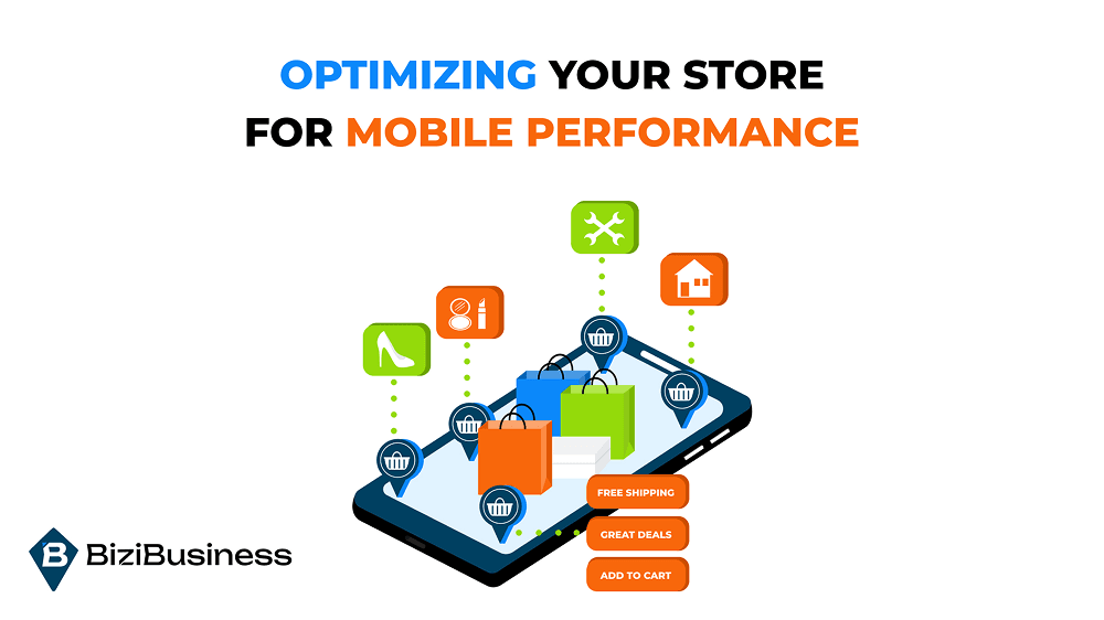
You don’t need a redesign. You need a rethink.
Because when it comes to mobile, the difference between browsing and buying often comes down to a few key performance factors. This is where you fix the friction—and make your store feel effortless.
Here’s how to optimize your site for smooth, fast, and high-converting mobile performance:
1. Prioritize Site Speed (Like It Pays Your Bills)
Because it does.
- Compress images (without killing quality)
- Use next-gen formats like WebP
- Minimize JavaScript and unnecessary plugins
- Use a content delivery network (CDN) to load assets faster
✅ Use tools like:
Google PageSpeed Insights, GTmetrix, or Lighthouse to test mobile speed and get specific fixes.
2. Go Fully Responsive (Or Better Yet: Mobile-First)
Responsive isn’t optional—it’s expected.
But mobile-first design goes a step further, building the mobile experience first instead of retrofitting the desktop version.
Make sure:
- Fonts are legible on all screens
- CTAs are large and spaced for fingers
- Layouts adapt cleanly across devices
✅ Test your site on:
iOS, Android, multiple screen sizes — real devices, not just simulations.
3. Mobile-Optimized Product Pages
This is where most mobile shoppers drop off.
To convert:
- Use large, swipeable product images
- Collapse long product descriptions into expandable sections
- Keep “Add to Cart” buttons sticky or easy to access
- Show price, reviews, shipping info above the fold
✅ Tip: Highlight mobile-friendly trust signals like “Free Shipping” or “30-Day Returns” right up front.
4. Streamline Your Checkout for Speed + Trust
Mobile shoppers hate long forms. Period.
To win the sale:
- Enable guest checkout
- Use autofill and saved info where possible
- Offer one-tap payment options (Apple Pay, Google Pay, PayPal, Shop Pay)
✅ Pro Tip: Use a progress bar or visual steps to reduce checkout anxiety.
5. Audit, Test, Improve — Repeat
Set up regular mobile audits using:
- Heatmaps (Hotjar, Crazy Egg)
- Funnel analytics (Google Analytics 4)
- Session recordings to see where users get stuck or bail out
✅ Don’t “set it and forget it.” Mobile behavior shifts fast—your store should evolve with it.
High-Converting Mobile Marketing Tactics
Getting mobile traffic is one thing.
Getting mobile conversions? That’s where the money is.
Here are the mobile-first marketing strategies that actually work—because they’re built for the way people use their phones: fast, personal, and always in motion.
1. SMS Marketing That Doesn’t Feel Like Spam
Texting is personal—so treat it that way.
Done right, SMS has open rates over 90% and click rates that crush email.
High-converting SMS ideas:
- Cart abandonment nudges: “Still thinking it over? Here’s 10% off.”
- Back-in-stock alerts: “It’s back. You’ve got first dibs.”
- Flash sales or VIP drops: “Text-only deal. Ends tonight.”
✅ Keep it short, branded, and timed with intent (not random blasts).
2. Push Notifications That Add Value (Not Noise)
If you have a mobile app or use web push, push notifications can re-engage and convert quickly—when they’re relevant.
Winning push tactics:
- Reminders tied to browsing behavior
- Personalized offers based on past purchases
- Urgent deals or “1 left in stock” triggers
✅ Use rich media (like product images) for more taps. And let users control frequency to avoid uninstalls.
3. Mobile-First Email Campaigns
Most people read emails on their phones—yet many emails still look like desktop leftovers.
Optimize for mobile:
- Short, punchy subject lines
- Large fonts, bold buttons
- Single-column layouts
- One CTA per email (max two)
✅ Use tappable product blocks, countdown timers, and dynamic content to personalize and engage.
4. Mobile-Exclusive Offers That Create FOMO
Reward mobile behavior.
Ideas that convert:
- Text-only discounts for SMS subscribers
- “App-only” deals and bundles
- Geo-targeted offers (“You’re near our pop-up store!”)
✅ These build loyalty and encourage channel engagement (like app installs or SMS opt-ins).
5. Smart Retargeting Across Devices
Most mobile shoppers don’t convert on the first visit.
Retarget them via:
- Facebook/Instagram ads with mobile-optimized landing pages
- Google Display Network with vertical ad formats
- Email flows triggered by mobile behavior
✅ Keep the journey cohesive: same messaging, same visuals, same frictionless path to purchase.
Bonus: Time, Context, and Convenience
Mobile marketing isn’t just about screens—it’s about lifestyle.
Ask yourself:
- Is this message showing up at the right time?
- Is it contextual to what they’re doing or just noise?
- Does it lead to a simple, mobile-friendly next step?
If yes—you’re not just marketing.
You’re meeting people where they are.
Personalization on the Small Screen
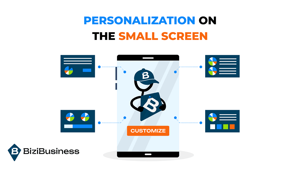
On mobile, space is limited—so every pixel has to matter.
That’s where personalization comes in.
Because when your messages feel like they were made for them, shoppers are way more likely to engage, click, and buy.
Here’s how to do it right (without being creepy):
1. Behavior-Based Targeting
Forget “Hey [First Name]”—true personalization is about context and timing.
Use shopper behavior to trigger:
- Product recs based on browsing history
- Reminder emails or SMS after abandoned views/carts
- Offers tied to what they added to cart (but didn’t buy)
✅ Tools like Klaviyo, Postscript, or Attentive make this easy to automate.
2. Geo-Targeting for Hyper-Relevant Offers
Location matters—especially on mobile.
Use it to:
- Promote local pop-ups or in-person events
- Offer shipping incentives based on region
- Run city-specific flash sales or exclusives
✅ Pair this with push notifications or SMS for real-time results.
3. Dynamic Product Recommendations
Personalized carousels = scroll stoppers.
Use real-time data to show:
- “Because you viewed…” product blocks
- “Others like you bought…” bundles
- “Complete your routine/look/setup” cross-sells
✅ Make these swipeable and tappable—zero friction, maximum engagement.
4. Mobile-Focused Segmentation
Not all subscribers shop the same way.
Segment by:
- Device type (mobile vs desktop shoppers)
- Purchase behavior (first-time vs returning customers)
- Channel origin (from SMS? app? social?)
✅ Then send mobile-optimized campaigns that speak directly to how they shop.
5. Leverage AI and Automation (Without Losing Your Voice)
Tools like Rebuy, Dynamic Yield, or even Shopify’s built-in AI tools can help deliver:
- Tailored email flows
- Smart product sorting
- Predictive upsells
But remember—automation is the engine, not the voice. Keep your tone real, warm, and on-brand.
The Role of Mobile Apps in E-Commerce Growth
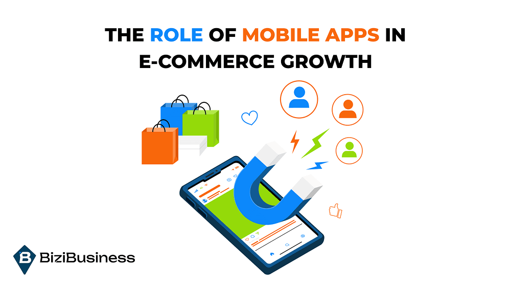
Not every brand needs an app.
But if your audience is loyal, engaged, and mobile-first… it might just be your next best growth move.
Because here’s what the numbers say:
- Mobile apps convert at 3x the rate of mobile websites
- In-app shoppers spend more time, view more products, and buy more frequently
- Push notification open rates are 4–6x higher in apps vs web
But before you dive into development, ask yourself one thing:
Do I need an app—or a better mobile site?
For smaller brands or first-time stores, a fast, optimized mobile website should always come first.
But if you’ve already nailed that and want more control, loyalty, and retention?
An app gives you a direct line to your customers—with no algorithm or ad spend in the way.
Why Mobile Apps Drive More Sales
1. Frictionless, Personalized Shopping
Apps let you remember:
- Preferences
- Cart contents
- Past purchases
… and customize everything around them. Every visit feels personal—because it is.
2. Instant, Direct Communication
Push notifications = no inbox, no spam folder, just instant reach.
Use them for:
- Flash sales
- Back-in-stock alerts
- Loyalty rewards and milestones
Done right, push feels like a VIP text from your favorite brand.
3. Loyalty + Retention on Lock
Apps make loyalty programs easier to run and more fun.
- Track points and rewards automatically
- Gamify purchases (badges, milestones, streaks)
- Offer app-only perks (early access, exclusive drops)
Shoppers love it—and stick around longer because of it.
When an App Doesn’t Make Sense
Don’t build an app just to say you have one. It’s only worth it if:
- Your mobile traffic is high and growing
- You have repeat customers who would benefit from convenience
- You’re ready to market it (an app without users = wasted investment)
If you’re not there yet? Focus on your mobile site and SMS/email list. That’s where the biggest early wins come from.
Tracking Mobile Success – Metrics That Matter
You can’t improve what you don’t track.
And in mobile marketing, the numbers don’t lie—they expose what’s working, what’s broken, and where the money’s being made (or lost).
Here are the must-track mobile KPIs every e-commerce brand should monitor — and what to do with them.
1. Mobile Conversion Rate
This is your North Star.
- How many mobile visitors actually complete a purchase?
- Is it improving over time?
Benchmark:
Most mobile sites convert at 1.5–2.5%. Great sites hit 3–5% and beyond.
If it’s low:
Check your load time, UX, checkout flow, and messaging.
2. Cart Abandonment Rate (Mobile-Specific)
Mobile carts are abandoned more than desktop—often over 70% of the time.
Track mobile abandonment separately so you can address mobile-specific friction points:
- Slow-loading checkout?
- No guest option?
- Tiny form fields?
Fix the issue. Then win them back with SMS or email recovery flows.
3. Page Load Time on Mobile
Google’s research is brutal:
1 extra second = 20% fewer conversions.
Monitor mobile load speeds regularly using:
- Google PageSpeed Insights
- Web.dev (Lighthouse)
- GTmetrix or Pingdom
Prioritize lazy loading, image compression, and CDN use.
4. Click-Through Rate (CTR) on Mobile CTAs
Whether it’s a “Shop Now” button or an “Add to Cart,” you need to know:
- Are people seeing it?
- Are they tapping it?
Use heatmaps (Hotjar, Crazy Egg) to watch tap behavior and spot drop-offs.
5. SMS and Email Engagement (Mobile Opens)
Over 60% of emails are opened on mobile.
SMS? Practically 100%.
Track:
- Open rate
- Click rate
- Time-to-open
Optimize content and links for fast mobile interaction—no pinching, zooming, or waiting.
6. Bounce Rate + Scroll Depth
If mobile users are bouncing or not scrolling far, you’ve got a relevance or UX issue.
✅ Use analytics to see:
- Which pages are underperforming on mobile
- Where drop-offs happen
- Whether CTAs are being seen before the bounce
7. Revenue by Device
Ultimately, this is the goal.
If your traffic is mostly mobile, but revenue is still coming from desktop—you’ve got a conversion gap to close.
Break down revenue, AOV, and purchase frequency by device type to diagnose performance gaps.
Pro Tip: Create mobile-specific dashboards in Google Analytics, Shopify, or your favorite BI tool. You’ll catch trends—and opportunities—faster.
Mobile optimization is never “done.”
But with the right metrics, you’ll always know where to focus next.
Common Mobile Marketing Mistakes to Avoid
Mobile users are unforgiving. One awkward scroll, one broken button, one slow load—and they’re gone.
Here are the most common mobile marketing mistakes e-commerce brands make (and how to avoid flushing revenue down the screen).
1. Treating Mobile Like a Shrunk-Down Desktop
Big mistake.
Mobile users need speed, clarity, and simplicity—not a miniature version of your desktop site.
Fix it:
Design mobile-first. Prioritize the most important actions and info. Use large fonts, clean layouts, and bold CTAs that work with thumbs, not against them.
2. Sending Non-Mobile-Friendly Emails
Ever opened an email where the text is microscopic, the images are cut off, and the CTA button’s nowhere to be found?
Same.
Fix it:
Use responsive email templates. Stick to one clear CTA. And test on multiple devices before sending.
3. Overloading Users With Messages
Mobile = intimate. If your push, SMS, and email messages hit all at once, it feels like digital spam.
Fix it:
Space out campaigns. Use smart automations and frequency caps. Let subscribers choose how often (and how) they hear from you.
4. Ignoring Checkout UX on Mobile
This one’s a dealbreaker. Clunky checkout flows are the #1 reason mobile shoppers abandon carts.
Fix it:
Enable one-tap payment methods, reduce form fields, support guest checkout, and optimize for autofill.
5. Failing to Track Mobile Separately
Desktop data ≠ mobile data.
If you’re only looking at blended metrics, you’re missing the problems—and the opportunities—unique to mobile.
Fix it:
Segment mobile performance in your analytics. Watch device-specific funnels, bounce rates, and drop-offs.
6. Neglecting Page Speed + Load Time
You’ve heard it before, and we’ll say it again: Speed is everything.
Fix it:
Compress, lazy load, and ditch anything that isn’t essential. Every extra second costs you sales.
7. Using Desktop-Centric Popups
If your exit-intent popups or overlays aren’t mobile-friendly, they’ll frustrate users—or worse, block navigation completely.
Fix it:
Use mobile-optimized popups with clear “X” buttons, tap targets, and timed or scroll-based triggers.
In mobile, there’s no room for “meh.”
It’s either smooth and frictionless—or it’s forgotten.
Clean up these mistakes, and you’ll turn frustrated scrolls into fluid conversions.
Mobile Isn’t Just a Channel — It’s the Core of E-Commerce
We’ve entered a mobile-first world, and in e-commerce, that doesn’t just mean more mobile traffic…
It means mobile is where your customer’s first impression happens, where decisions are made, and where purchases either flow—or fall apart.
If your mobile experience is slow, clunky, or disconnected, your store won’t just struggle to convert—it’ll get left behind.
But here’s the good news:
Optimizing for mobile doesn’t require perfection—just intention.
Because every scroll, tap, and second of attention is a chance to build trust—and earn the sale.
And the brands that understand that?
They’re the ones leading the charge into the future of e-commerce.
FURTHER READING


Subscribe to Newsletter
Unlock your creativity and stay up to date on marketing tips